Web Conferencing has been defined by two important stages of development:
- “The Broadcast Stage”: A host broadcasts a webcam feed and their screen share.
- “The Collaboration Stage”: A host uses a variety of tools to foster collaboration and engagement.
For a long time, most platforms were pretty much limited to broadcasting.
As it stands, we’re in the era of engagement. As invaluable as webcams and screen shares are, businesses need web conferencing to spur collaboration. The above two features only go so far.
Yet, many platforms out there are still built around the basics of broadcasting! Some will include chats and annotation while screen sharing, but little else.

That’s why we see Adobe Connect as being so different. The platform was built from the outset to foster collaboration and create engagement. Adobe Connect was designed with a rich feature set – and it’s held up!
In this blog, we’ll look at how the features and functionality in Adobe Connect differentiate it from competitors.
Which of these factors matters most to you?
–Layout All the Features You Need
Click on the one you’re most interested in!
.
The Rich Feature Set of Adobe Connect
Most Diverse Feature Set
We’ve analyzed dozens of platforms on the market, and none we’ve found quite compete with the total number of features in Adobe Connect. And that says nothing of the unique functionality also available in Adobe Connect.
Most platforms cover the basics: Webcams, screen share (with annotation), attendee list, and chats. To get more features, you have to go up a pricing tier.
Adobe Connect* offers much more:
- Screen Sharing (includes a built-in whiteboard, annotation functionality, and the option to upload documents)
- Notes
- Attendee List
- Webcam
- Chat
- File Sharing
- Web Link sharing
- Polls
- Q&A
- Engagement Dashboard
- Breakout Rooms (up to 20)
(The below picture shows a number of the features in various configurations.)
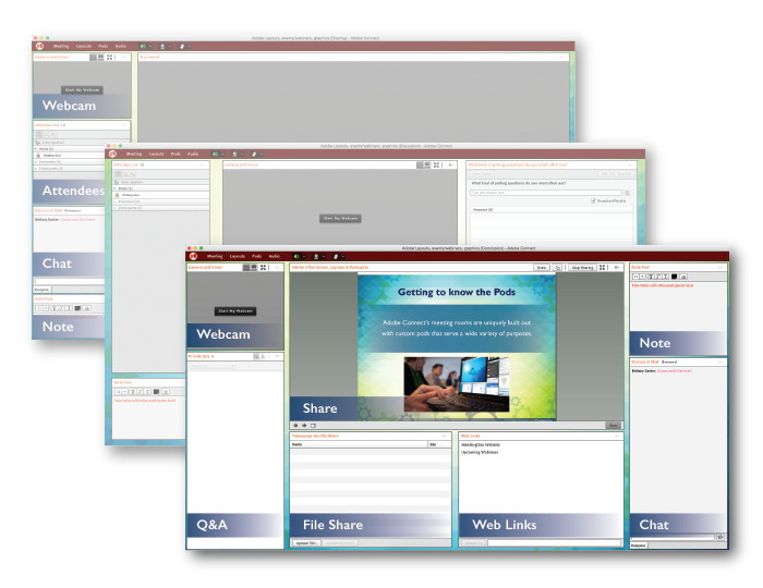
The best part about Adobe Connect is that all of these features are available across their license tiers! Whether you’re using Adobe Connect for online meetings or webinars, you can use these great features!
Looking at a competitor, Zoom offers a comparable feature set. They even offer more breakout rooms. Yet, they don’t provide Notes or Q&As in the meetings solution.
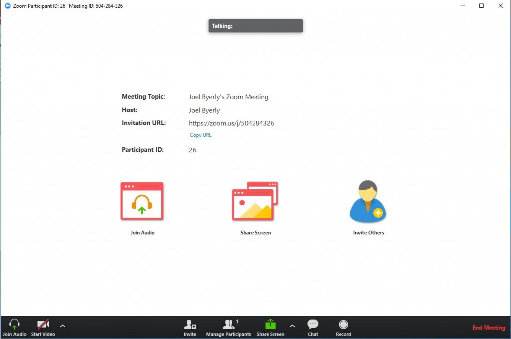
One of the annoying things about Zoom is that you have to toggle on many of the features you want to use in-room! While your screen share and chat are enabled by default, you have to go through the tedious task of turning other features:
- File Share
- Breakout Rooms
- Private Chat
- Attention Tracking
All of the features in Adobe Connect are available to use immediately! No turning on or off settings. You’re ready right out of the gate. So start collaborating!
*Freemium version of Adobe Connect does not include the full feature set.
Unique Features
Web Links
The Web Links pod in Adobe Connect allows room hosts to place specific links in one of the modules. These links can then be named.
Why is this feature beneficial, though? Isn’t it best to just share a URL in the chat?
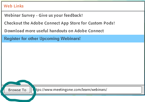
Sharing in chat may be quicker, but the web links feature allows you to rename links. So, people have a better sense of where they will be directed.
Also, where a URL may get buried in a chat throughout a session, the web links pods can be situated so links are continuously present.
Lastly, a host can use the Web Links pod to send everyone to a specific site. Can’t do that with a chat! This functionality is great when discussing online reports, websites and other pages during meetings. Everyone is taken to the same page so that the conversation can start up with the same info on everyone’s screen.
Engagement Dashboard
The Engagement Dashboard is Adobe Connect’s tool that tracks participant engagement. As the name suggests, engagement metrics are displayed on the Dashboard. The Dashboard also charts other important aspects about:
- Poll Responses
- Q&A Questions/Responses
The Engagement Dashboard can only be seen by room hosts and presenters when the Presenter-Only Area is opened. The Presenter-Only Area is basically a “green room” space for your online events. (More below.)
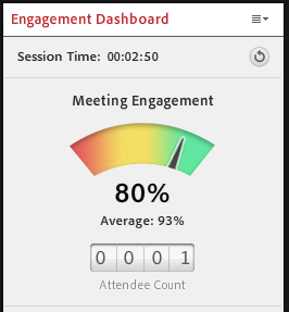
This is one of those great features where we see why Adobe Connect is different. Most platforms – including Zoom, Webex, and GoToMeeting – only track “attentiveness.” But what is attentiveness?
Attentiveness sounds good, but the name’s misleading. All they are tracking is how long their platform is the primary window on your screen. I could be part of a Webex meeting and never actually pay attention. But because I keep the window up on my screen, it will look like I’m engaged.
Adobe Connect has higher standards. Their engagement tracking includes “attentiveness.” It also accounts for much more:
- Actions taken in the room, like participating in a poll or chat.
- Updating the status setting.
- Mouse activity in the window.
- Decay of attention over time. If a participant was active early but then disengages, Adobe Connect accounts for this by downgrading their engagement score over time.
Get the full picture on engagement tracking in Adobe Connect.
Presenter-Only Area
The Presenter-Only Area is a feature unique to Adobe Connect. Think of it as a green room or backstage for your online events.
Only room Hosts and Presenters can see the Area when it’s open. This is where the Engagement Dashboard resides. Users can also store secret chats – for Hosts and Presenters alone – here.
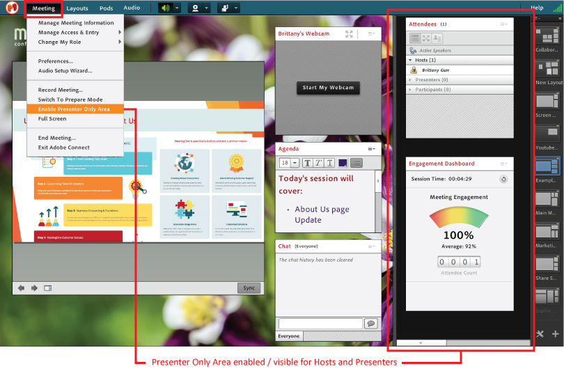
Learn more about the Area in this blog!
.
Greater Functionality
Adobe Connect’s large number of features is impressive. More impressive still is the functionality unique to those features.
Enhanced Feature Functionality
Annotation
The Adobe Connect Share Pod was designed for several purposes:
- Screen sharing
- Uploading and Displaying Presentations
- Playing Videos
Documents and videos can be uploaded into the Pod, making it possible to add text or draw on them in the moment!
The annotation feature set includes various tools for drawing or making notes:
- Pencil
- Highlighter
- Marker
- Pen
The following types of shapes are available to use:
- Square
- Circle
- Arrow
- Line
- Check Mark
- Star
All of these shapes can be sized up or down.
For all of the above, thickness and color can be selected. As for the shapes, you can differ the fill and outline colors, if you so choose. Furthermore, you can decrease opacity to create certain effects.
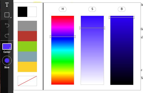
Of course, you can undo or redo changes, or trash goof-ups as needed. Lots of functionality, no doubt!
The only similar feature set is offered by Zoom. Here’s a screenshot of the tools they provide.

For comparison, here’s a look at what GoToMeeting offers in their lower end version.
![]()
Nothing wrong with these tools. They do the job. But as you can see, there are fewer options available to you.
It is Adobe Connect vs. Zoom when it comes to the best annotation feature on the market.
Q&A Pod
Many platforms geared toward webinars offer a Q&A tool. Attendees can ask their question, and then a host will respond. The questions and answers can be shown publically or privately. Using a Q&A feature is ideal for ensuring questions don’t go unanswered. (They can easily be missed in a chat.)
Adobe Connect, as mentioned, offers a Q&A pod for every license tier. What differentiates the platform is the ability to assign questions. The lead host can take certain questions and give them to the person they believe is best suited to answer. The other presenters can set a pod status to show only their questions. As questions are divvied up, presenters will see the questions assigned to them.
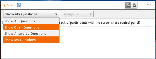
The ability to distribute questions is highly desirable during large events. We have some customers who host thousands, and the topics can get technical. They will have a small team on hand to answer the questions coming into the Q&A, with the host pushing them out to the right person.
Attendee List
Adobe Connect’s Attendee List is like many competitors’. You can see who’s on the call, and in what role. You can promote/demote attendees. You can see if someone has their hand raised. And if you have audio integration from MeetingOne, you can see who’s talking, mute or unmute them, or disconnect them all in the same space!
What’s cool about Adobe Connect’s Attendee List is the opportunity to see participation levels. By turning on “Show Individual Engagement,” you can see how engaged someone is.
- Green indicates they are consistently engaged and interacted.
- Yellow indicates they are engaged but not as active.
- Red means they are disengaged and inactive.
(Their score is derived from the engagement scoring discussed above.)
Having these insights is a huge boon for anyone – but it’s especially beneficial during online training and webinars, where you need to be sure how engaged individuals are.
The functionality discussed above is significant. While many platforms share certain features, only Adobe Connect takes them to the next level.
Live Room Edits
Adobe Connect also allows hosts to use the “Prepare Mode” to edit their room during live events.
The Prepare Mode isolates Layouts for a host to navigate through and adjust without being seen by anyone else in the room.

Prepare Mode
Let’s say you are in Prepare Mode and select a Layout later in the presentation. Although Adobe Connect will take you directly to that Layout, the participants and other presenters will remain at the same stage of the presentation and in the same layout.
You can then edit a layout, add a pod, or manage/update documents without interrupting the presentation. By clicking the Prepare Mode icon again, it will close out and place you back in the layout with that the rest of the audience and presenters.
The value is very apparent. And Prepare Mode is very applicable to webinars and professional training presentations. Add File Share or Web Link pods last-minute without any problems! Or, you can change/add a layout to incorporate interactive features (chats, polls, etc.) if you worry there’s not been enough engagement.
.
Layout All the Features You Need!
Adobe Connect offers users “layouts” that can serve a number of purposes. Each layout can work as its own little room, with a feature set the room host customizes to their needs.
In one layout, you could just feature a screen share and webcams. In another, you could include a chat and attendee list. There are endless numbers of ways to format these layouts!
For webinars and virtual trainings, these layouts can be used as transitions between different stages in a presentation. Just finished preparing a lecture section and want to quiz your audience? Clone an existing layout, add a poll, and then do some re-formatting. (That’s exactly what we did for a webinar – watch the below video!)
I love the flexibility multiple layouts offers. For my room, I have one layout for my regularly scheduled meetings, one for blog screenshots ;), and another for the presentations I occasionally give.
I typically start with a blank layout and then add in features according to my expected needs:
- Internal Meeting: Screen share, webcams, file share
- External Meeting: Screen share, webcams, notes
- Online Presentation: Screen share, webcams, chat, attendee list
I like that the features are right out in front for everyone to use, and I can size them to maximize my room’s space.
See the Difference for Yourself
We’re in the era of web conferencing collaboration. Feature richness will be a crucial factor for businesses looking to drive collaboration and engagement during their online events.
While many platforms pick and choose between features, Adobe Connect has gone all in. Their feature set is the most extensive on the market, and they offer unique functionality no one else has.
For those of us who need to collaborate regularly during online events, Adobe Connect provides all the tools you could want!
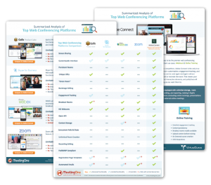
If you’d like to learn more about how web conferencing leaders compare, download our comparison guide!
Or, you can trial Adobe Connect to experience the difference firsthand!


