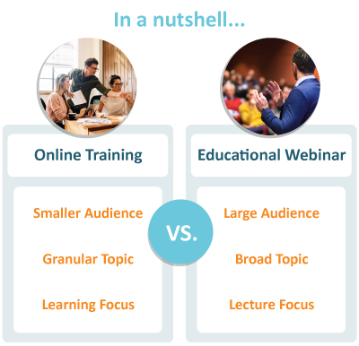
There’s an old idiom you don’t hear much anymore: “An embarrassment of riches.” When you have a lot of options to choose from and struggle to know where to start, you suffer from the embarrassment of riches. That’s what it feels like with online training these days. There’s on-demand, self-paced, or mLearning. Or it could be live training, in a virtual classroom or educational webinar.
The ready availability of such training opportunities is terrific. Workers can learn from their computer or phone anywhere in the world, and enhance their skill base or learn about a new product. Can’t argue with that type of opportunity!
Alas, all is not perfect in paradise.
An issue has arisen for “live online training.” All too often online trainings and educational webinars are used interchangeably. That might not seem like a big deal, but it is.
An online training and educational webinars should serve different purposes and audiences.
Identifying when you should use a virtual classroom vs. a webinar for instruction can be difficult. At MeetingOne, we understand this is a challenge. We’ve been at this game a long time.
For years, our Customer Support team has trained organizations intending to use virtual rooms for either online event, online training or educational webinar. That’s on top of the frequent webinars we help produce and our own MeetingOne webinars that educate on various topics related to enhancing the online setting.
We’ll help you better understand the differences between online training and educational webinars. As a bonus, we’re going to provide some design tips that will help you build out your virtual rooms to accommodate each type of event best!
Online Training vs. Educational Webinar
So, what really determines when we should lead an online training vs. educational webinar?
There are two factors: audience and material. Dubbing a session either an “Online Training” or “Webinar” sets the basis for learners’ expectations. Using these terms willy-nilly can get throw an audience off. Consequently, the learning material must align to audience size and expectations.
Let’s see how they play out in the contexts of an online training or an educational webinar.
Online Training
“Training” itself gives the impression the lesson will be “hands-on,” so to speak. If you’re going to call it an “Online Training” or suggest “Training” will be involved, the learners attending will expect to participate with a smaller, more intimate class with full access to the instructor.

The environment you want is a virtual classroom. Virtual classrooms utilize tools like chats, polls, web cams, white boards, and breakout rooms, among others, to get learners participating and responding to the material. These features are ideal for driving interactions and instructing on specific topics.
And that’s what online training is all about. Online training in a virtual classroom should be used to lead focused discussions on particular topics. Topics that are pertinent to those participating. Topics that learners can apply to their immediate work. Topics where their opinion can hold sway in the conversation.
Whatever you do, don’t pull people into an “online training” and then talk at them for two hours. …Unless you’re hoping that participants won’t retain a bit of what was discussed 😉 Online training should be learning focused and get participants engaged in digestible amounts of time (30 mins – 1.5 hours is suggested).
Educational Webinars
“Webinar.” In today’s world, everyone knows that a webinar is an online event that will facilitate an informational session for a large audience. People know when registering that it will be educational, and they will likely be just listening. One other expectation to keep in mind: Time.
Webinars can be held internally or externally. Their purpose is to reach a large number of people all at once. People typically expect webinars to be around an hour. These factors impose the “restrictions” on content.
Webinar content should be broad when used externally. They can provide basic guidelines for certain practices or thought leadership without being overly instructional. Anything “high level” should be thought of in webinar terms. And it should be lecture oriented with set engagement features like pre-set polls, file shares, and Q&A.
Here’s a good example. We recently helped put on a webinar called, “Brain-Based Principles for Maximum Retention in Virtual Classrooms.” (Go ahead and watch the on-demand webinar.) It covers all the bases we just discussed:
- Broad Topic: How neuroplasticity impacts learning retention.
- Basic Guidelines: We offer 6 brain-based principles that are can be used in the virtual classroom setting.
- High Level: “Principles” is a great cue – it indicates the topic will be introductory.
- Lecture Orientation: While there were some polls, the majority of the webinar was lecture based.
While neuroplasticity may not feel like a simple topic, the way we approached the presentation allowed for the webinar to be “high level.” Thus, “educational webinar.”
Webinars can also be held internally. When our organization holds internal webinars, it’s usually to present on new products or offerings. There’s a general overview followed by group training later on (if needed).
However you use them, keep in mind that educational webinars should remain broad and informative. The presentation should be a lecture-based and can engage audiences in pre-set ways.
Design Differences for Your Online Events
Having built out virtual rooms for online training and educational webinars, we here at MeetingOne have learned a few tricks we’d like to pass on. (Note that we work with Adobe Connect, so our design instruction is based on the customizability of the rooms and the ability to design them before a session. Learn more here.)
Virtual Classrooms
The virtual environment and hands-on training. An impossible pairing, no? Not if you incorporate the right design elements and features! Potentially, it can even be better than face-to-face!
Virtual classrooms should be designed to engage learners as you might in a physical space. So, what does that entail? Minimally, identifying and using the right features.
#1. Chats & Polls
Chats and polls are pretty much ubiquitous across virtual classroom platforms. And this makes sense. They are simple features that drive engagement, and they can be used throughout.

A chat can serve a few functions. It can either be the discussion board, where learners can throw out questions or comments. Or it can be the main vehicle for answering questions if learners don’t have mics. Either way, chats gives people a chance to participate even while others are talking.
Polls are great too. They get people interacting and thinking. They can be used as quizzes, and they help trainers accurately assess knowledge transfer.
What’s unique about Adobe Connect is that you can run multiple chats or polls at the same time. (With most platforms, it’s an either/or situation.) Concurrent chats or polls allow your audience to respond to multiple topics or questions in a manageable way. This by necessity increases the duration of their engagement and consideration of the topic.
We would recommend using a continuous chat throughout and add polls frequently. Learners attention span wanes after 10 minutes, so at these intervals, it’s good to re-engage with a poll or chat.
#2. Whiteboards
Whiteboards are ideal for the virtual classroom. They provide something closer to a “hands-on” feel for online training. Not only can you simulate a “chalkboard,” you can have groups annotate documents and images in the virtual classroom. A solid activity to pair discussions.
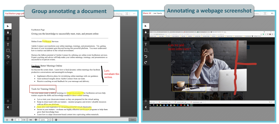
The above two images are good examples from Adobe Connect. The one at left shows a group working to enhance the proposed text for a web page. The one at right displays a screenshot Adobe Connect took of an active web page. Notes can be immediately added to these screenshots.
(In Adobe Connect, these annotated documents and images can be saved and exported for later review!)
Designing a Solid Virtual Room
#1. Multiple layouts
All virtual classroom platforms come with a pre-formatted space for you to work with. Some are pretty basic and can’t be modified.
Adobe Connect has multiple virtual spaces, called “layouts,” built-in:
- Sharing. Emphasis is placed upon screen sharing and initial lecture.
- Discussion. This layout offers a forum for participation. Several chats, a poll, and some note pods.
- Collaboration. To drive interactions, this layout features a whiteboard.
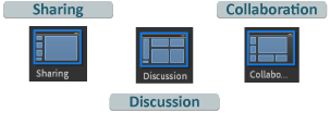
These three layouts would meet the needs of many online training sessions. You can lead your initial presentation in the Sharing layout, turn the discussion over to participants in the Discussion Layout, and then let them interact with materials in Collaboration.
If you’re more of a DIY trainer, you can customize each room with the features you want, and as many layouts as you need. The results are virtual classrooms suited perfectly to your training needs. These tailored rooms can always be templatized in Adobe Connect for organization-wide needs.
(See how we use multiple layouts for educational webinars below.)
#2. Breakout Rooms
When designing an online training, you’re going to want learners to have the opportunity to discuss and collaborate among themselves. What you’ll want to use are breakout rooms. They are perfect for small-groups to work together! Small group conversations tend to reflect workplace interactions better, as well.
In Adobe Connect, breakout rooms can be preloaded with content and formatted before the session begins. Getting a room situated before a session helps reduce the transition time between the main discussion and group split off. Better conversations are the result!
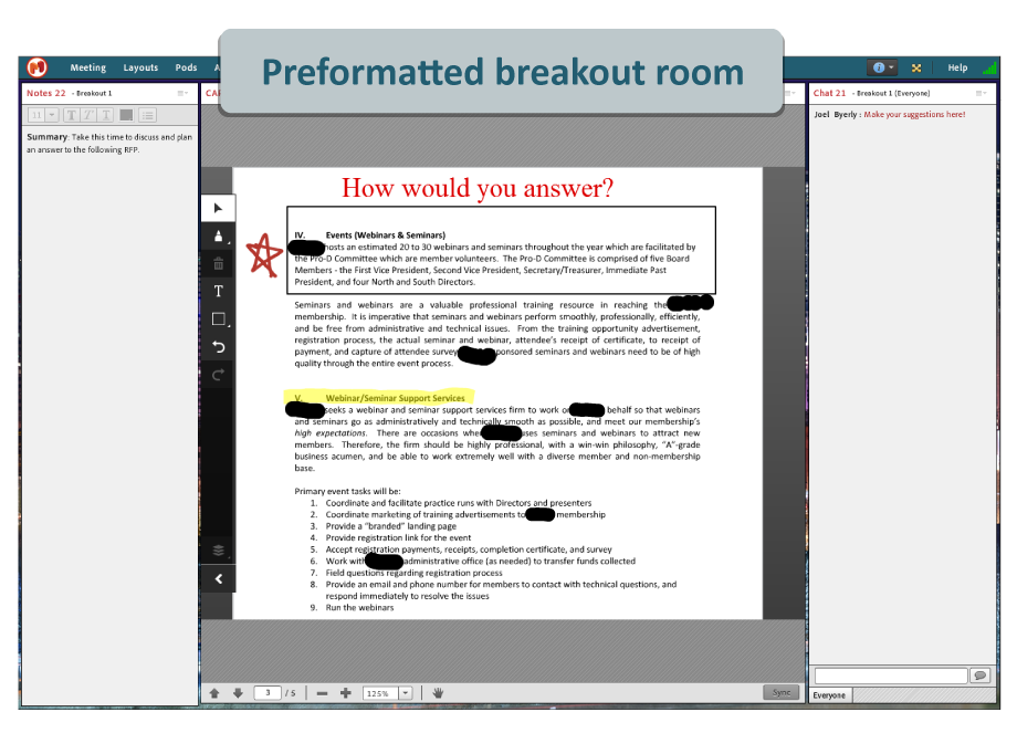
In the above example, learners are tasked with devising a solution for this RFP. A note section and a chat provide space to propose ideas. With microphones on, the learners can also throw their ideas out over the “airwaves.”
We’ve seen good results allotting session time to breakout groups after long lecture sections. Once you get into that collaborative phase of your training, you should plan to include breakout rooms.
To recap:
- Regularly use polls and chats keep learners engaged;
- Whiteboards are a great way to give learners a “hands-on” activity;
- Use multiple layouts to move through different stages o the training; and
- Start breakout sessions to drive group led collaboration.
These factors will differentiate your online trainings from educational webinars by ensuring your learners’ participation is prioritized. We want them feeling as if the information taught so they can apply it immediately to their job. That’s what we could call learning focused.
Webinar Rooms
At MeetingOne, we like a more interactive approach to webinars. Yes, educational webinars are first and foremost informational, so lecture is a necessity. But a little engagement goes a long way. Interactions can increase retention, in turn making your webinar more memorable.
But keep it simple. You don’t need to have the audience to respond to every tidbit shared. Poll, chat and Q&A pods are ideal. They provide audiences the opportunity to interact, air thoughts, and voice questions.
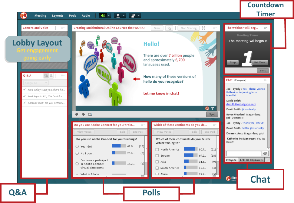
One of the tricks we’ve learned over the years is to create a “Lobby” in Adobe Connect. We outfit the lobby with a Q&A, polls, chats, a countdown timer, and sometimes a fun “custom pod” like a word cloud or MP3 music player. These features tend to drive early engagement and give us some ideas of what attendees want to get out of the session. Here’s an example of what our lobbies look like:
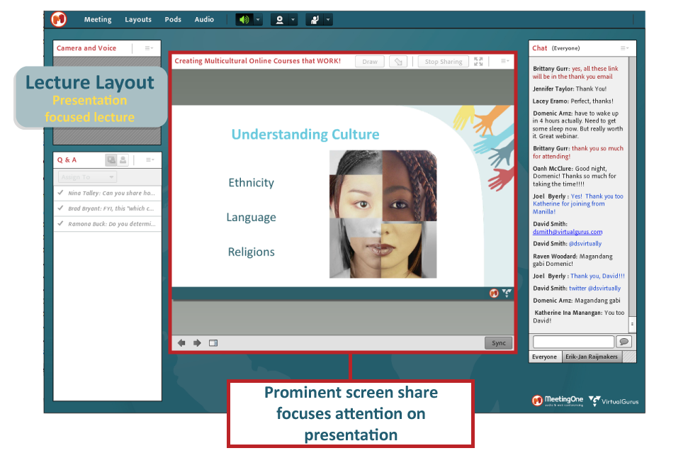
Additionally, to strike that lecture-engagement balance, we utilize Adobe Connect’s function to create an unlimited number of layouts. Then, we alter layouts to reflect the presentation. For sections that are information heavy, we’ll limit the number of interactive pods. As you can see below, this layout is designed to focus the audience’s attention on the PowerPoint presentation.
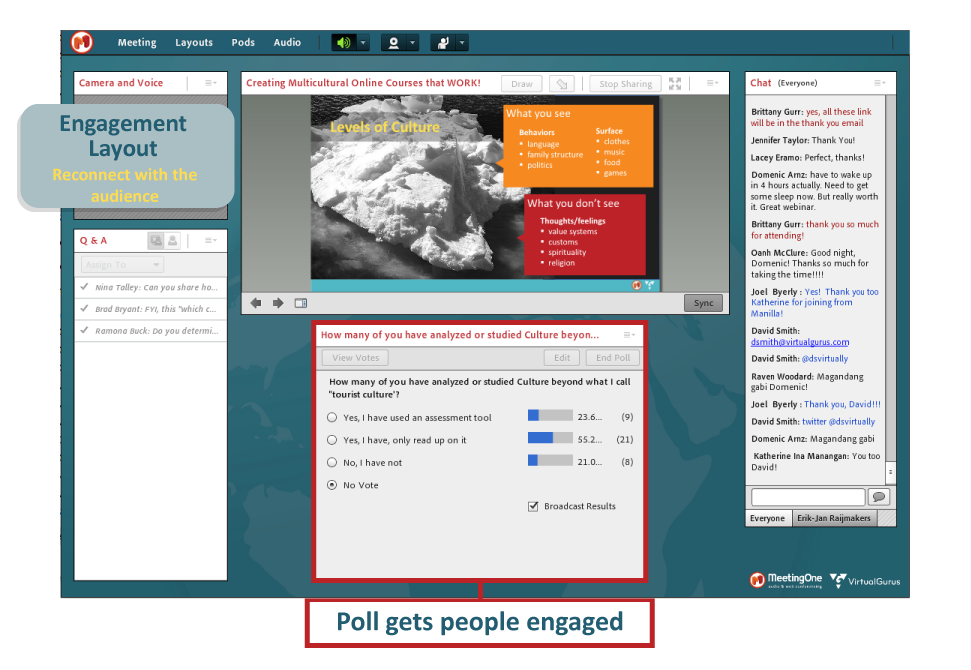
We then introduce layouts specifically intended to drive engagement. Maybe we want to pause the presentation for a moment and ask a question. Well, we design a layout that keeps the slide on the screen while presenting a poll or two. Gets the audience thinking and engaged. During the presentation, our host will transition to that layout as they wrap up their point.
Lastly, we always finish with a Conclusion Layout. It’s a must for educational webinars. It provides a space for sharing the presentation slides and other takeaways. And ending on engagement helps to continue the conversation after the event is done.
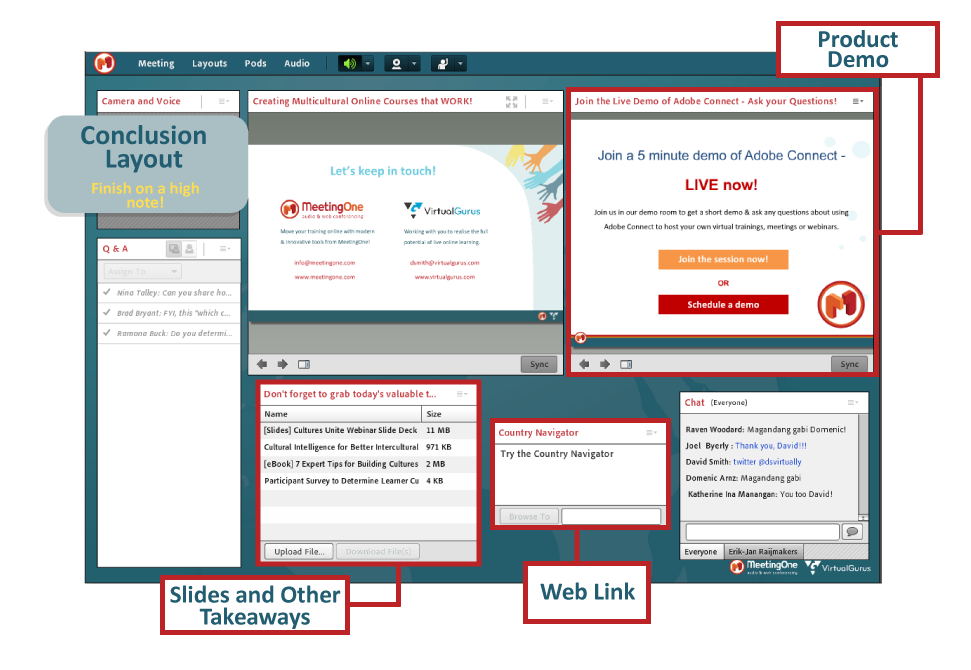
You may have noticed the “Q&A” and “Chat” remained throughout these various layouts. We like keeping the Q&A pod available at all times, so participants feel comfortable asking questions. As for the “Chat,” it’s a space that allows for attendees to participate without stopping the presentation. We feel a little side conversation during an educational webinar is not a bad thing.
Just remember:
- Get the engagement going early with a Lobby;
- Move between layouts that are lecture focused or interactive; and
- Finish with a Conclusion Layout that offers participants the chance to download relevant documents or explore a webpage.
Building an educational webinar in this way will ensure your lecture is focal when presenting to a large audience. But they won’t feel that you’re just a talking head. It will be a webinar that proves educational and memorable.
Get it Right Every Time
At the end of the day, there’s a big difference between an online training and an educational webinar. Those participating will expect an online training to be more learning focused, built to help them uptake skills orinformation. An educational webinar, on the other hand, can help introduce individuals to new concepts on a high level. Both can benefit a learner; the purpose is simply different.
If you apply the right design approach and shape your content to reflect these audience expectations, you can feel confident your online training or educational webinar will achieve your goals!
(Oh. And it helps to have Gartner’s top rated learning/webinar platform: Adobe Connect.)


