 You’ve put together a webinar you know people would flip over.
(Or at least that’s the hope…)
Don’t waste your efforts by slacking on the webinar invite!
.
Webinars are primarily used by organizations looking to distinguish their brand, connect with new people and share their expertise and passion. The trickiest part of hosting a webinar is getting people to register and attend!
Consider it this way: you could spend hours crafting the perfect webinar. You could create the best content the world’s ever seen. You could have every slide so well timed, people might start calling you Maestro. But what does it matter if no one attends? Worse yet, what if no one even looked at the webinar invite you prepared? That would truly be a shame!
Crafting the Perfect Webinar Invite Email
Email inboxes nowadays are flooded with webinar invitations. Each day, hundreds of thousands of webinar emails are sent out. (That doesn’t come as a real surprise – webinars have become essential for marketing teams driving for lead conversion.) It makes sense that email open rates hover around 25% (as of earlier this year) – people are getting inundated!
Nailing the webinar invite is just as important as putting together an interesting and useful webinar. But what differentiates an amazing invite from the one going into people’s spam boxes? A successful webinar invite doesn’t take much…just five simple things!
5 Keys for a Perfect Webinar Invite Email
- Uncluttered Text with One Link. There’s one goal of the webinar invite email: get readers to your webinar’s registration page. All you need is one link!
- The ‘Who,’ ‘What,’ & ‘When’ of the Webinar. Include what matters: Who is presenting, what their topic is, and when the webinar will be happening.
- Simple Subject Line. 50 characters or less, including [Webinar], [Webcast], or [Webinar Series]
- Personalized “From” Email Address. Never use a “Do_Not_Reply” from-address again. Use a personal or corporate name.
- Dynamic CTAs to Drive Registration. Make your CTAs visible, fun, or emotional, and repeat it as a banner, button, and hyperlink.
And don’t forget! Send reminder emails leading up to the event! Check out the full Slideshare at right!
Learning from MeetingOne’s Webinar Invites
At MeetingOne, we’re nearing the three-year mark of our webinar marketing program. That’s three years of webinar invites. In those three years, we’ve produced over three dozen thought leadership webinars, a handful of series, and we’ve helped co-market just as many with our partners, like Adobe, Carahsoft, and Virtual Gurus. And our optimization email efforts have grown with the 5 above, simple tips.
These webinars have featured thought leaders of online meetings, virtual training, and marketing webinars. Crafting emails for such widely different audiences has been challenging at times. And it has involved a lot of adaptation and tinkering. Here are a few examples below:

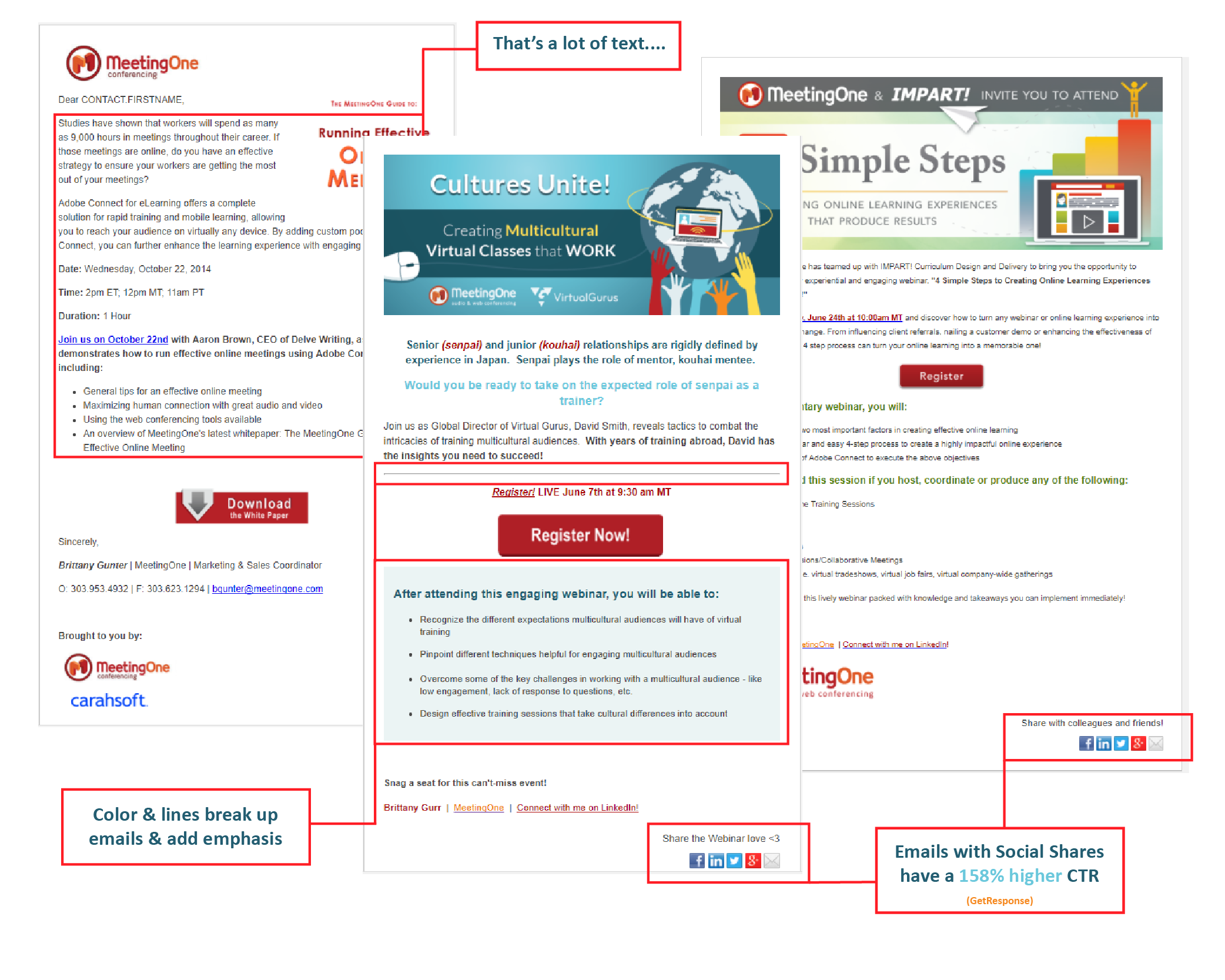
The email at left was an early webinar invite we sent out. The one at right is just over two years old. And the one in the center was sent out recently. Although the formatting has remained consistent, there are five big differences:
- Less Text. One of the first things we learned was to reduce text. Get people to the relevant information! Constant Contact has found that it’s best not to go over twenty lines of text, or 200 words, for marketing emails. And with everything moving to mobile, compatibility is a must, and less text helps.
- More Graphical Elements. It wasn’t long before we introduced well-designed banners into our invitations. Making emails more graphical is critical, as visual cues encourage readers to scroll. As you can see, our latest email includes more coloration and other visual elements. (Bold type, flat graphics, unique images: all good and trendy.)
- Social Sharing. We introduced social sharing options after our first few webinars. We did so after learning GetResponse had found social shares to increase click-through by 158%.
- Larger CTA. Our Call-To-Action has moved and changed some with time. First, we placed it near the bottom. Then, we moved it to the middle, immediately after the important webinar info. Lately, we’ve increased the size of every CTA to make them more visible.
- Date & Time. Early on, we would lay out the time and date of a webinar on separate lines. To save space, we’ve since placed all that information on one line, beside a secondary CTA.
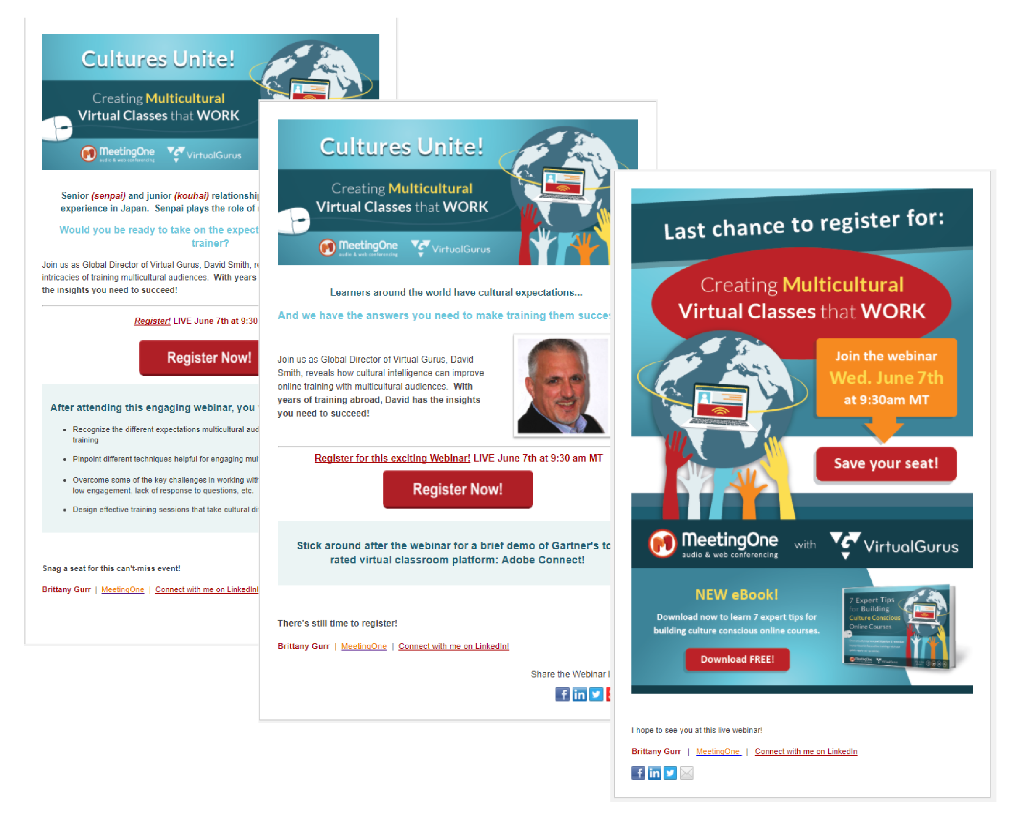
We also run series of three emails for our webinars. As you will see below, each webinar invite is different. The first has the most information, including bullets outlining relevant topics that will be discussed. The second draws more attention to the speaker by incorporating his/her picture. Our “Last Chance” email is mostly graphical, given it also serves as a reminder.

Much of what I’ve covered above addresses how we’ve come to drive more clicks for our webinar invites. What I haven’t noted is how we’ve increased Open Rates.
Increasing Open Rates
Like all of you out there, we’ve been working hard to increase our Open rates for each webinar invite we send. Getting there has involved two significant changes to our approach:
- Increased Segmentation
- Aggressive Contact Filtering
.
Increased Segmentation
Everyone knows you have to segment. Generalized emails simply don’t drive the engagement you need.

When we first started the program, we were sending pretty broad emails out, simply banking on catchy subject lines. In the last year, we’ve increased our segmentation significantly.
At this time, we have broken out various lists by title, industry, customer, and lead. We can now use 23 lists for our webinar emails. This makes it much easier for us to address our different audiences in more direct and meaningful ways. We’ll tailor our subject lines and email body to reflect those groups’ pain points and needs.
Although we’re still surveying the results of segmentation, we know we’re engaging more qualified leads. And our connection with customers makes them “more sticky.”
Aggressive Contact Filtering
Sure, it feels good to look at your contact list and be able to say, “We have a million billion contacts.” But if only 1% of your million billion open emails from you, it’s pointless. Having thousands of inactive contacts can only hurt your “rating” with email providers.
When we first started our webinar program, we filtered some. We had our “Watch List” and “Unsubscribe List.” That certainly helps. But when we decided to more aggressively filter our lists in the last quarter, it was like watching Bruce Lee in “Enter The Dragon.” We were chopping through hundreds of contacts that were simply not engaged.
The result has been tremendous. For our webinars, we’ve seen a 15% increase in open rates in just a few short months.
Rock Your Next Webinar

Now that you have the knowledge, we hope you will be able to nail every webinar invitation from here on out! Unfortunately, your work’s not over. Even after you deliver that fantastic webinar, you still have one task left. To learn what you still need to do – check out the second part in our blog series:

Ever worry your webinars aren’t getting enough traction?
Try the platform geared for driving engagement!
More advice on crafting webinars awaits you! Subscribe to our blog today! Good luck during your next webinar!


 You’ve put together a webinar you know people would flip over.