What Makes Adobe Connect Different? Customization
Each and every online event is unique. Different speakers, different content, different audiences. Even if you’re hosting a recurring virtual training, or redoing a past webinar, the engagement levels and outcomes may vary.
But one of the things I’ve noticed is that most events are basically the same. And it doesn’t seem to matter what platform you’re on. Trainings in Zoom. Webinars in Blue Jeans. Meetings in GoToMeeting. They all feel just about the same. It’s as if they are taking place in the same virtual space.
This level of uniformity just begs the question, Why?
It comes back to the simple fact the developers of these platforms and others decided that’s what they felt was best. Maybe they wanted to keep things simple, a conclusion reached based on use case studies. Perhaps it was an effort to keep development costs down.
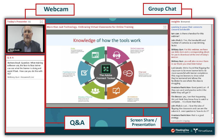
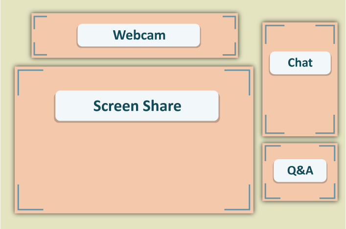
Whatever the case, most platforms were designed to only feature the same basic elements: Screen Share, Webcam, Chat, and Q&A. And there’s a rigid format they all pretty much adhere.
Here’s what that format looks like:
Here are 4 platforms that follow this model:
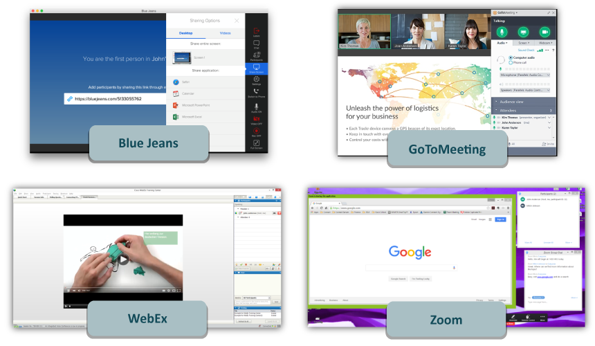
From personal experience, I can attest to the fact that Blue Jeans, GoToMeeting, WebEx, and Zoom all use this format. (For an in-depth platform comparison, check out our breakdown!
Sure, there are small branding opportunities in just about every platform. And some offer you the ability to slightly modify the size of certain features.
But in a world stressing the importance of expressing ourselves and making brands stand out from the pack, isn’t it short-sighted to limit our ability to bring this into our virtual collaboration spaces? If we all agree that each online event is unique, shouldn’t the virtual spaces we use to present online be truly customizable? Shouldn’t you be able to shape the virtual space you’re working in to reflect your vision for the event? To make them TRULY unique and memorable? (Phew – just had to get that off my chest…)
Well, you can with Adobe Connect. Adobe Connect is loaded with functionality that makes it possible to design rooms suited to your event needs!
In this blog, we’ll go through all the awesome ways you can customize Adobe Connect rooms!
What does Adobe Connect Customization Entail?
 Adobe Connect allows you to break from the boilerplate model depicted above. You have complete control over the way your rooms look – from the colors to the position and size of your pods (i.e. the modules that hold your chat, screen share, webcam, etc.). So, to say the least, customization is integral to Adobe Connect.
Let’s dig into the ways you can customize Adobe Connect rooms: In-Room and Admin customization.
In-Room Customization
There is a lot to be said about what all is entailed when you customize Adobe Connect rooms. We’ll dig into the big 3: Sizing & Positioning Pods; Layouts; and Preferences
Sizing & Positioning Pods
Each and every pod in Adobe Connect can be placed anywhere in the room and stretched to any size. Need to feature just a Screen Share during an online meeting? Easy enough! Other pods can be “hidden,” then the Share Pod can be scaled to fit the entire room.
The same is true for every Adobe Connect Pod. Webcams, chats, notes – every pod can be sized and positioned to fit your needs.
We’re talking about truly customizable online training, meeting, and webinar rooms.
There are obvious benefits for a number of use cases. Trainers who want their virtual space to conform to the content can easily do so. For sessions that are lecture heavy, a trainer can feature just the Share Pod and webcam feeds. If it’s a time to move to a group discussion, an additional chat can be added in seconds. Want to drive engagement? You can place multiple polls to spark interactions.
For webinar marketers, the freedom to customize a room your events is highly desirable. At MeetingOne, we tailor each of our rooms to fit the unique needs of our events. We will make our lobbies distinctive. Sometimes they’ll feature several polls, other times a custom pod. It all depends on what type of engagement we’re hoping to generate.
We primarily feature the following pods during events: Webcam, Screen Share / Presentation, Chat and Q&A. And we lay them out in this way.

This layout is primarily suited for the presentation. When we want to spur engagement, we’ll throw in a Poll (see the example in the video below). Striking a balance between lecture and engagement is key. Learners are more likely to retain information if engaged. And once captivated, leads are more likely to keep interacting with your organization!
Layouts
So, we know every pod can be moved around and placed anywhere. Then they can be sized up or down. But it doesn’t stop there. Each Adobe Connect room comes with an unlimited number Layouts, and each functions like a little room.
In one layout, you could feature only a Share Pod for lecturing purposes. The next layout could include more interactive elements, like a Chat or Poll. You can have as many Layouts as you’d like. Or you can keep it simple and use the 3 that come with Connect when you create a room.
Multiple layouts have obvious benefits for marketers who put on webinars. As they transition through their presentations, marketers can also shift between different layouts. Rather than stop the entire flow of the event to poll, you move to a Layout that features the presentation AND a poll. This is exactly what we do during our webinars.
(The video features a Host’s view. Participants cannot see the layout bar at right.)
Transitioning between Layouts is key to our webinars. It allows us to quickly shift from lecturing to engaging participants without interrupting the session.
Those of you who are online trainers can build out your custom online training in a similar way. Different layouts for different sections of your material.
This functionality also serves individuals who host lots of online meetings. One layout can be used for “one-on-ones.” Another layout for discussions with leads. A third for team huddles.
However you use Layouts, they truly offer you the ability to customize your events. There is simply no other platform that gives you this type of functionality and flexibility.
Backgrounds
For whatever reason, the events I have attended online – meetings, trainings and webinars – tend to feature backgrounds with one of two colors: Blue or Black. And there’s a simple design. Most room backgrounds look like the default image that comes with your PC. (Snoozeville…)
Backgrounds shouldn’t be an afterthought! Uploading a dynamic background to your room can set the tone for your events, or reinforce your brand!
In Adobe Connect, we would encourage you to use images that are 1920 x 1200px in size. The Aspect Ratio we recommend is 16:10. And with each image you upload, make sure to include your brand name or logo in one of the corners. (Get our branding guide for Adobe Connect!)

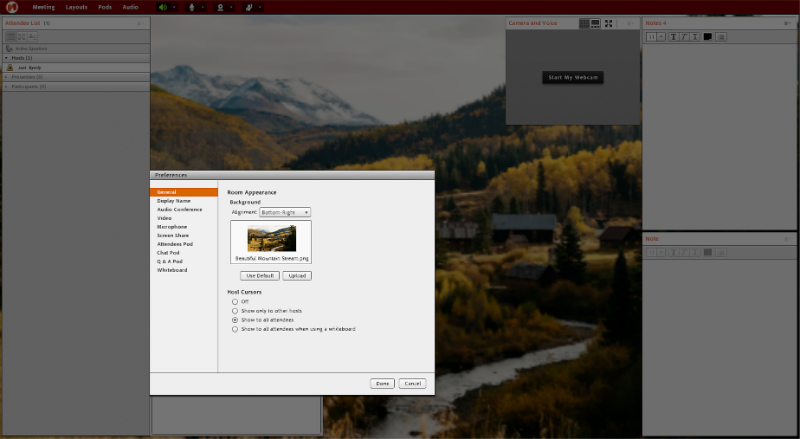
Uploading backgrounds is also a very simple process. In Adobe Connect, it only takes a few steps. In your room, you select the Meeting tab, scroll down to Preferences, and then click on General. You’ll be prompted to upload a file from your computer. Easy.
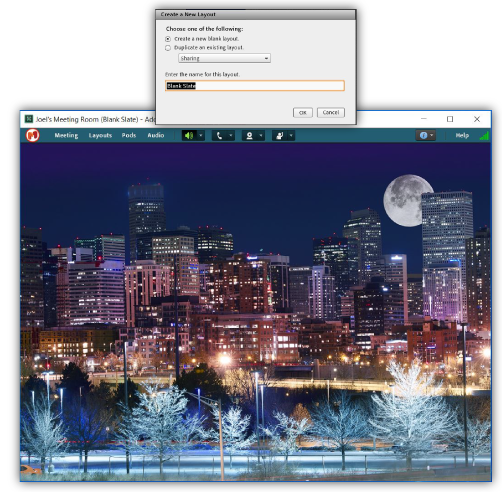
Blank Slate Layout
I personally take customization very seriously for my online meetings. It may seem silly. What do really need in a meeting room beside a screen share and webcams?
While it might seem unnecessary, I like the opportunity to build out a room from scratch. Doing so requires I actively think about the conversations I intend to have, and what will make these discussions most productive.
Here’s my approach from start to finish!

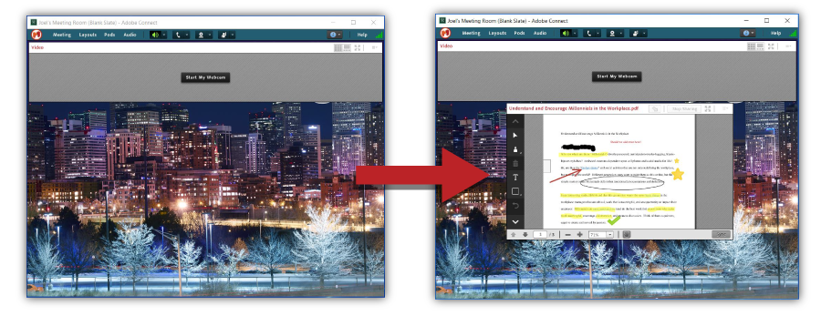
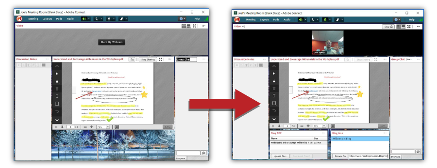
Webcams are a must. In the online setting, being able to see who you’re talking to adds an important human element. So, I’ll add the Video Pod at the top.
Then, I’ll throw in a Screen Share. The importance is pretty obvious. Being in a writing position, I’m frequently revisiting and revising documents. With Adobe Connect, I can quickly upload a PDF of my article into the Share Pod. From there, it can be annotated and discussed!

I’ll also add a Notes Pod if I think the conversation will get very detailed. Often, I’ll include in a ChatPod so attendees can throw out links that may be relevant to the talk.
Lastly, I’ll include Web Links and File Share Pods, so everyone can have access to the document we are getting into.

Not every layout I make looks like the above one, and I don’t always include every Pod listed. It’s just an example of why I like the freedom to customize my online meetings.
Gotta love the freedom to customize Adobe Connect rooms!
Admin Customization
In-room customization gives each user the freedom to create a space perfect for their needs. But for large organizations, being able to customize some account-wide settings is even more important.
These settings can all be defined to reflect your brand. Colors, logos, messaging – all possible from Adobe Connect Central. And each change you make on the Admin side will affect every room on the account, which ensures ubiquitous branding for all your account users.
Here are the things you can customize to reflect your brand: Rooms, Login Pages, & Adobe Connect Central (the admin hub).
Adobe Connect Meetings
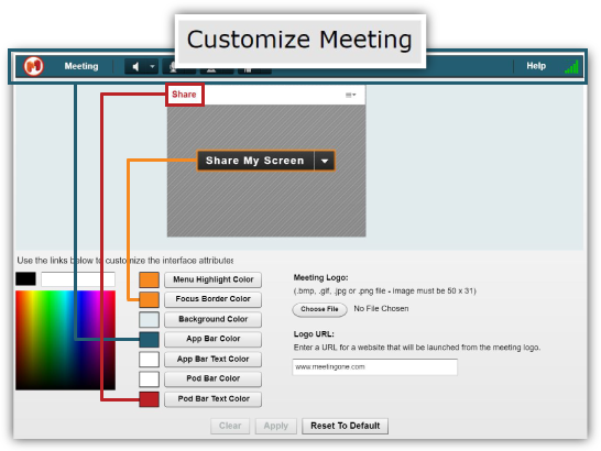
Real quick, scroll back up and look at the first screenshot you see. Notice how the pod text is red? That’s our brand red. And that is the text color for every room on our account!
There’s a number of features you can customize to your brand colors. Here’s how we would recommend you color them.

Pod Colors
The bar at the top of each pod, along with the text, can be colored. While it might seem like a small aspect of your branding, it nonetheless remains a valuable option.
We would suggest you use a lighter color, like a grey or white, for the Pod Bar, and a more vivid color for the Text. A red is ideal if it’s in your brand’s palette. Doing so ensures the text stands out and catches the eye.
App Colors
Customizing Adobe Connect rooms also entails branding the App colors. But what are we referring to when we say “App colors?”
Well, we’re basically talking about the prominent bar at the top of your room, and the color of the text running along that bar. A strong contrast is again important. We would suggest a darker color for the bar, and white for the text.
Let’s look at MeetingOne’s branding. Our primary colors are red and orange. We also use contrasting colors, specifically three shades of blue. By using a dark blue in the app bar, we give a definite border to the room that doesn’t demand too much attention. Your eyes are still drawn to the text color – red – of our pods.
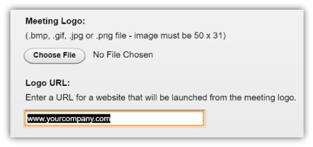
You can also place your logo at the top left in the App bar. The logo you upload should be 50 x 31px for best resolution.
There’s one other cool thing I’d like to point out about the logo. You can embed an URL in it. Every time someone clicks on the logo in the top left corner of your room, they’ll be redirected to the web page of your choice!

Other Colors
Customization doesn’t end there, though. You can also add colors for the following three options:
- The Room Background (if you aren’t using an image)
- Menu Highlight
- The “Focus Border” for the Share Pod
Use this helpful guide keep all these branding elements straight!
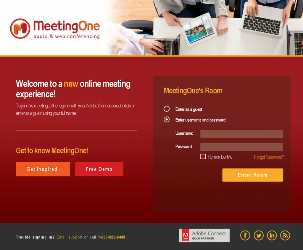
Adobe Connect Login
When it comes to hosting a custom online training, webinar or meeting, having a unique login page is a big benefit.
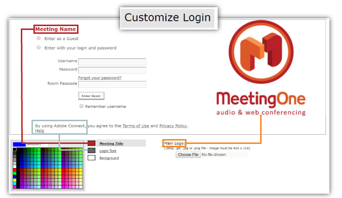
Adobe Connect provides you several ways to brand the login page for your events. You can pick out brand colors for the:
- Meeting Room Name
- Login Text
- Background

Selecting the right colors comes back to the visual hierarchy you want to create. Your priority should be the “Meeting Room Name.” Steering them there first ensures they efficiently move through the login flow. The background should probably be a lighter color. Consequently, the Login text is better off a bit darker.
But don’t forget about your logo! You can upload your logo and place it on the login page. Just make sure your background color doesn’t clash with your logo colors.
Lastly, we would recommend you use an image that’s 410 x 310px.
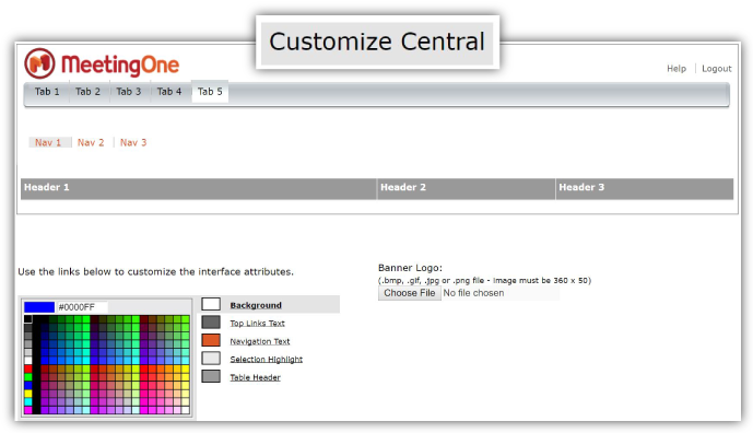
Adobe Connect Central
Last but not least, you can also brand your admin home – Adobe Connect Central.

While only your teams will see it, it is beneficial to maintain branding throughout your organization’s account. You can brand the following within Adobe Connect Central:
- Background
- Navigation Text
- Selection Highlight
- Top Links Text
- Table Header
Make sure your Banner Logo is no larger than 360 x 50px.
All of these elements give you the opportunity to incorporate brand images, like your logo, and brand colors throughout your Adobe Connect account. The consistency between things like the login page and the room help reinforce your brand during any custom online training, webinar, meeting or other event.
MeetingOne takes Connect Customization to Another Level
Customizing Adobe Connect doesn’t have to end here, though! MeetingOne fulfills Adobe Connect’s commitment to customization by providing terrific services that ensure you’re designing your custom events well, and add-ons that can boost your brand’s presence during these sessions.
If customizing your events from beginning to end is a necessity, you’ll definitely want to learn more about MeetingOne’s solutions for Adobe Connect.
Full-Service Event Production
Putting on large events like webinars and webcasts can put a lot of stress on your team. A marketer’s focus should be on creating highly engaging content. Too often, though, attention is pulled in a number of different directions. Production logistics. Technical issues. Team management.
MeetingOne’s Full-Service Event Production was designed to help marketers return to what’s important – the content. We take the burden off your back by managing production factors pre-event, in-event, and post-event. These include managing:
- Dry-run through logistical details
- Technical training for presenters
- Audio feature activation pre-event
- Live support in-event
- Q&A management
- Audio quality monitoring
- Handling event recordings
- AND MORE

But Full-Service goes beyond just the technical side of things. We pair you with a dedicated Full-Service Event Producer. This provides you a hands-on consultant who will help you at each stage of the event and offer feedback tailored to your use case. There’s a lot that goes into it! They can help you:
- Plan the workflow of your presentation
- Build out your Adobe Connect room to drive interactions
- Create enticing registration pages
- Compile event reports
At each stage, we give you the best input for creating events that engage participants. In the long run, we’re helping you get the most out of customization within Adobe Connect.
But don’t think this and like services are only for marketers! We can help you put on custom online training and large-scale meetings. Moreover, we can help moderate high capacity conference calls.
Custom Login / Registration Pages
We touched on the importance of the login page earlier. They place your brand front and center before your events. Establishing that presence is very important.
That said, Adobe Connect only gives you so many customization options. If you want a fully branded login page – we’re talking colors, logos, content, slogans – we can custom design a login page for you.

Every time someone logs into your Connect Room, they’ll see your custom login page.
If you want to take your customization even further, we can even help you customize Adobe Connect event registration pages.
Custom Audio Prompts & Welcomes
Imagine this scenario: You’re hosting an online meeting in Adobe Connect. As folks join your room, your angelic voice comes over the line to greet them. They are transported into a more blissful state, where online meetings are friendly and engaging!
While it’s unlikely anyone will reach a state of Nirvana in your meetings (here’s to hoping, though), custom greetings hold a great deal of value. It presents another branding opportunity and provides that friendly interaction so critical to ensuring participants are engaged.
MeetingOne offers custom audio prompts for both Adobe Connect and AudioOne conference calls. No matter the nature of your event, adding a custom greeting to your room is so valuable. Read more about custom greetings in our blog post!
Now it’s Your turn to Customize Adobe Connect Rooms!
I’ll concede a little here. Having the same basic format does make it easy for hosts to jump in a room and know what’s available to them immediately. You have to spend some time playing around in Adobe Connect to really get the most out of the customization functionality. But once you’ve tinkered with your Adobe Connect rooms, you’re going to appreciate the freedom!
(You’re not required to re-design your room over and over again, by the way. Once the changes have been made, they are saved, and your room will continue to “persist” unchanged through time. Read more about “Persistence” in this blog!)
If you’d like to tailor each room to your events, you must go with Adobe Connect. That flexibility allows you to create events that will better engage and involve participants than any other platform.
Learn more about Adobe Connect! Or talk to one of our Product Specialists about a MeetingOne solution suited perfectly to your needs.


 Adobe Connect allows you to break from the boilerplate model depicted above. You have complete control over the way your rooms look – from the colors to the position and size of your pods (i.e. the modules that hold your chat, screen share, webcam, etc.). So, to say the least, customization is integral to Adobe Connect.